media matics

Logo, Branding, Web Design

Concept art / Drafts

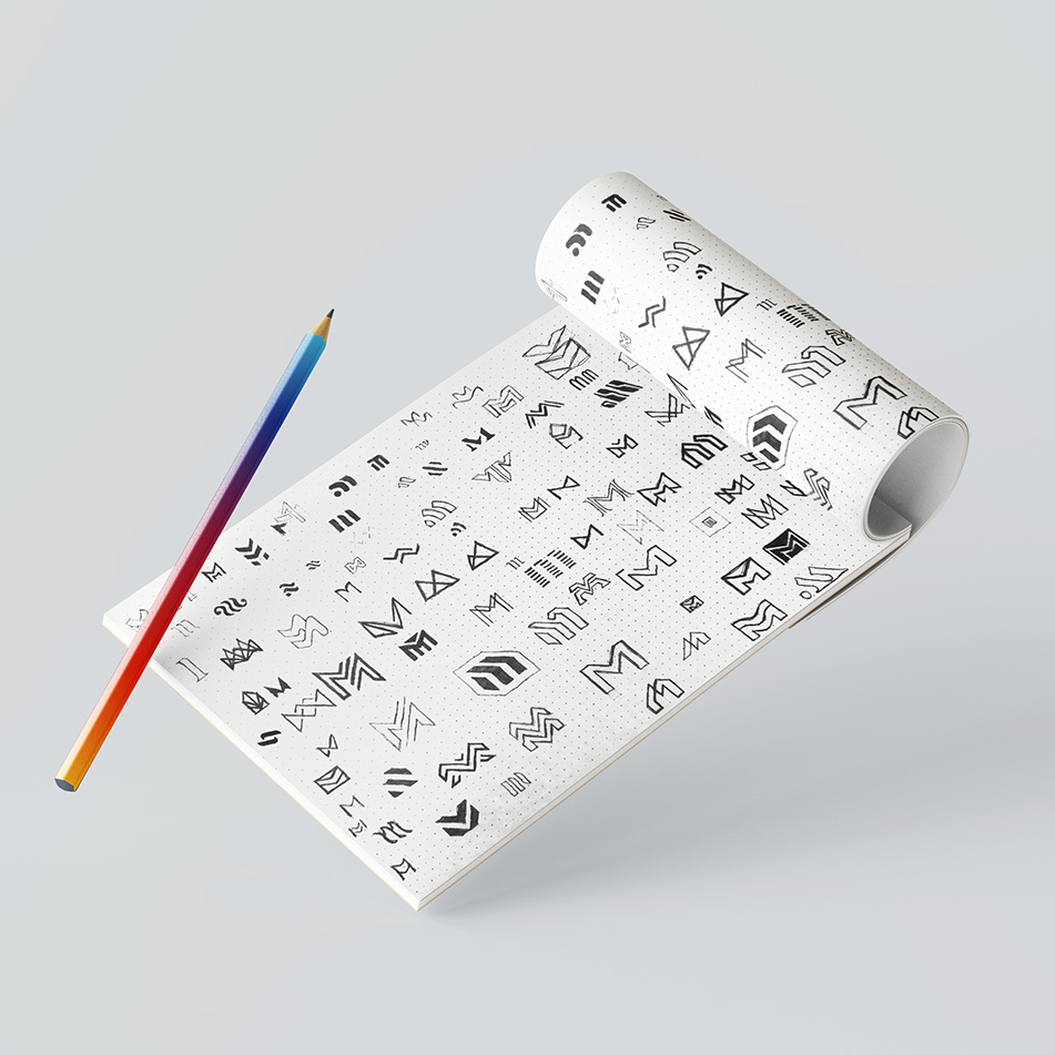
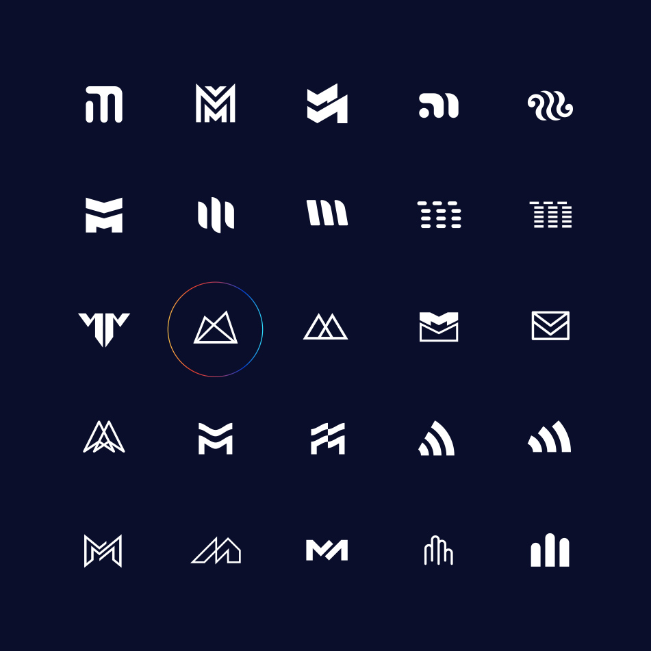
The brand MEDIA MATICS deals with broadly understood mailing. I wanted to combine M letters with something close to mailing association. I started working with the traditional method of pencil on paper. I sketched a lot of ideas and then the ones I chose were digitized.

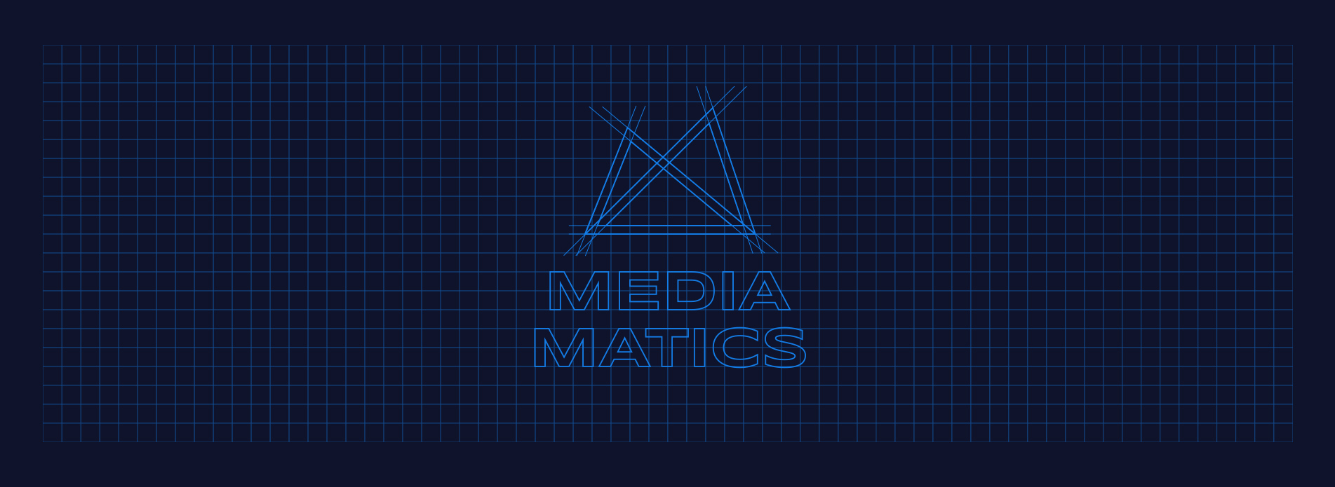
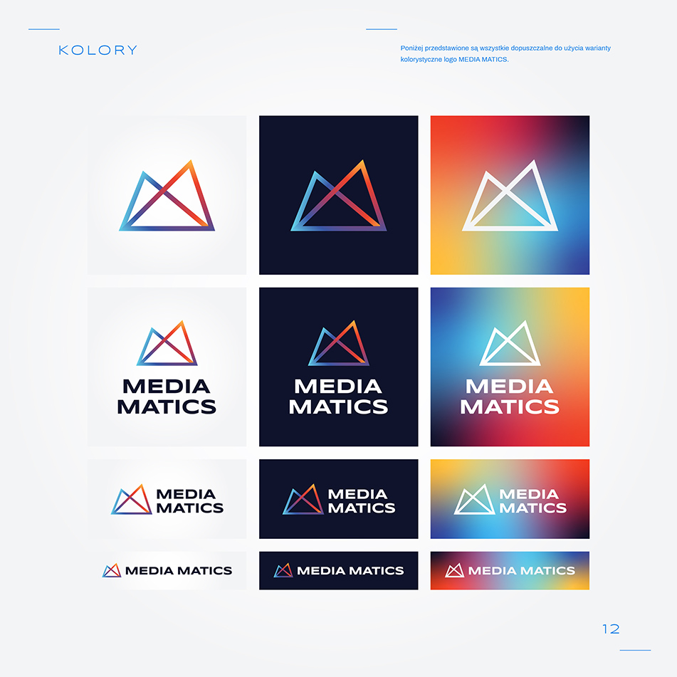
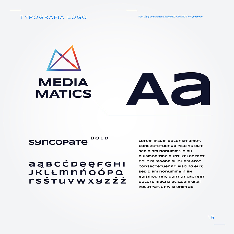
After the client chose the final signet ring, next step was to create perfect lettering. I decided to use Syncopate Bold Font.

Brand design

The next step was to choose the colors and create the Key Visual elements. Typography as well as colors and shapes create a very distinctive visual arrangement. The very dynamic overtone of the project emphasizes the advantages of the brand as an innovative and dynamic company. I created short Guideline Book to be sure, client’s  mark will be consistent and stable in future.

Web Design

The key element of the brand’s image is its website. I designed the views of each subpage.