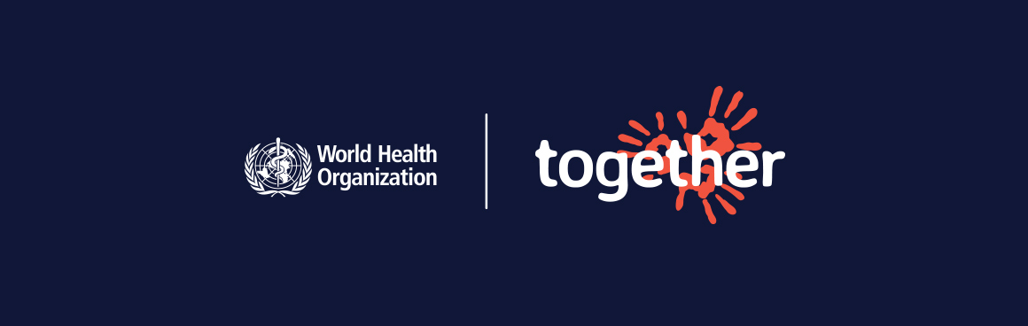

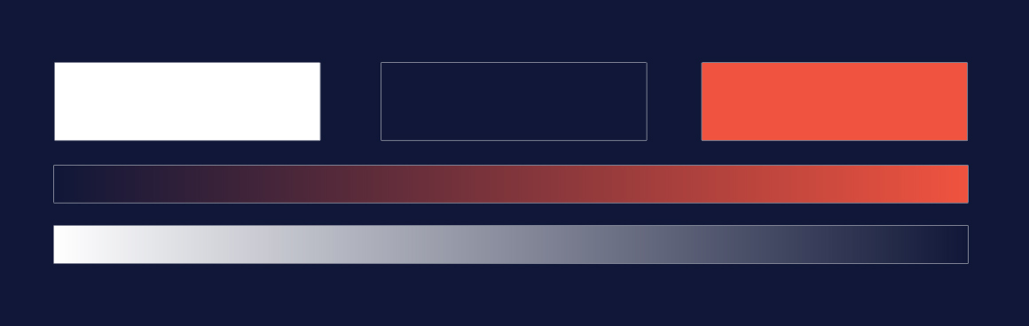
I had the privilege of spearheading the creation of a compelling brand identity for a significant initiative: Raising Awareness About Cancer event, commissioned by none other than the esteemed World Health Organization (WHO). Tasked with crafting a cohesive visual representation, my role encompassed the development of a consistent color palette, a captivating logo, and a distinctive key visual that would resonate with audiences worldwide. With a keen eye for detail and a deep understanding of the event’s objectives, I meticulously crafted each element to encapsulate the essence of the cause and evoke a sense of urgency and empathy.
together
logo & branding

Introduction
Realisation
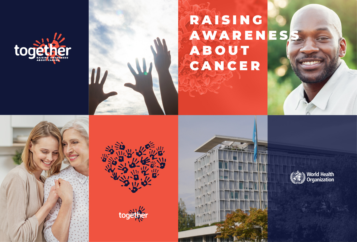
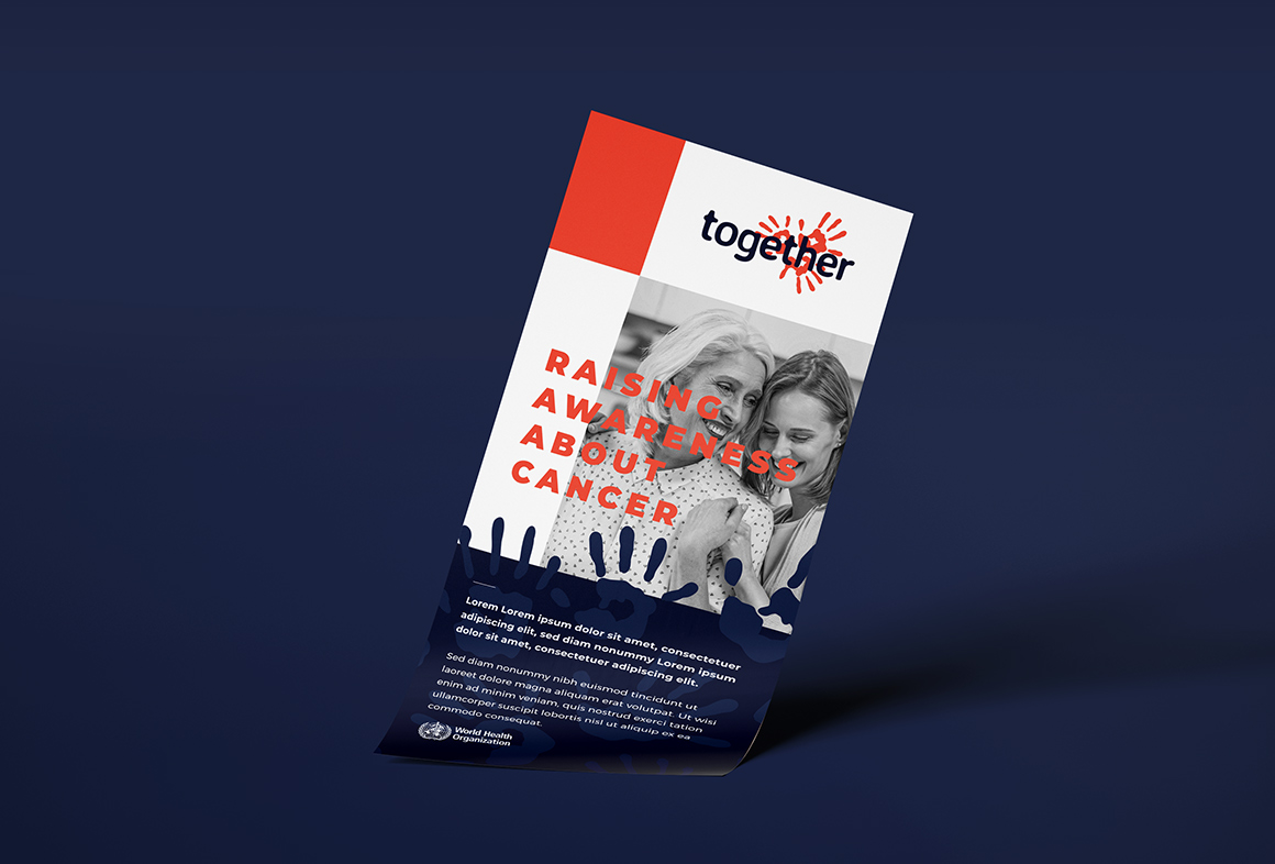
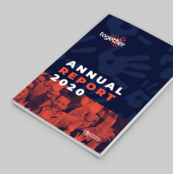
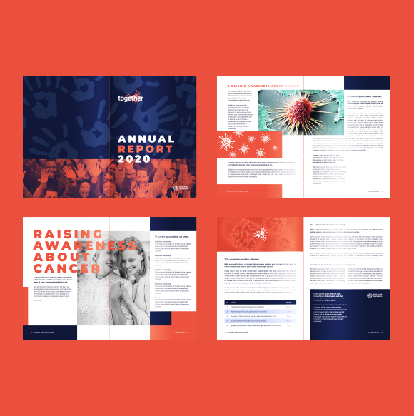
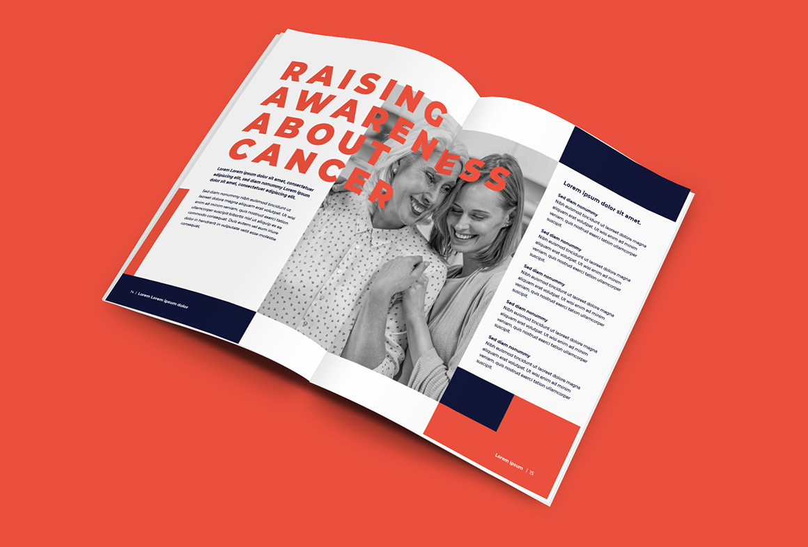
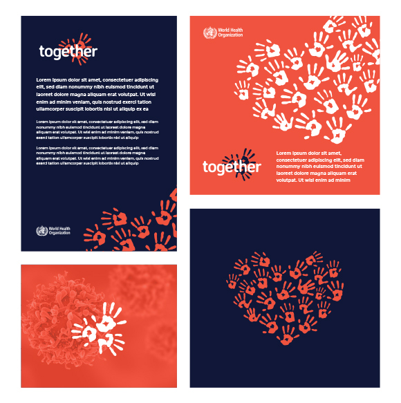
The impact of my work extended far beyond mere aesthetics, as the identity I crafted served as the cornerstone for a plethora of materials aimed at informing, engaging, and mobilizing communities. From informative flyers to comprehensive annual reports, the WHO utilized my identity to convey crucial information and foster meaningful connections with their audience. Through seamless integration across various mediums and platforms, my design not only elevated the event’s visibility but also facilitated a deeper understanding of the importance of cancer awareness and prevention on a global scale. This project stands as a testament to the power of design in driving meaningful change and amplifying the reach of vital public health initiatives.
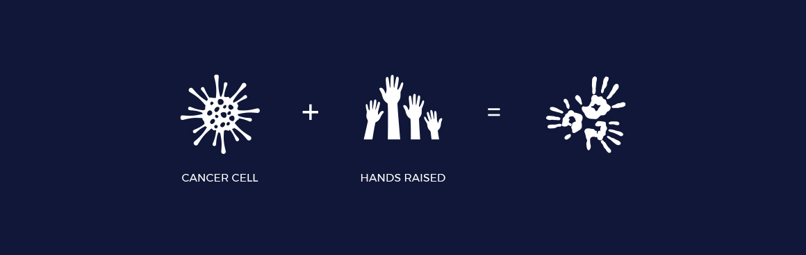
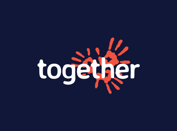
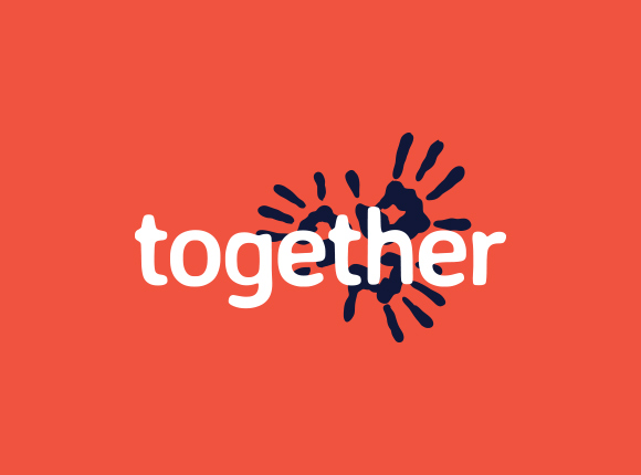
Symbol
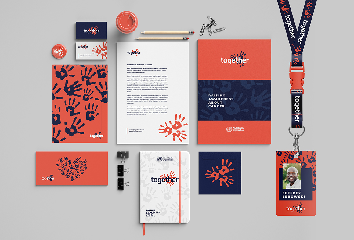
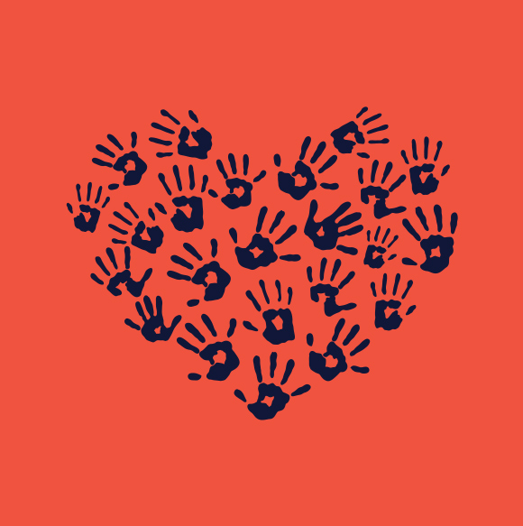
This innovative fusion not only served as a visual representation of the event’s mission but also evoked a powerful sense of hope and community engagement. The synergy between the cancer virus cell and the human hands underscored the interconnectedness of individuals in combating this formidable disease, reinforcing the notion that collective efforts are essential in effecting meaningful change. Moreover, by infusing the logo with symbolism that resonated deeply with audiences, I ensured that it became a rallying point for participants and stakeholders alike.
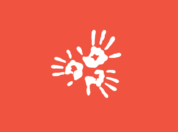
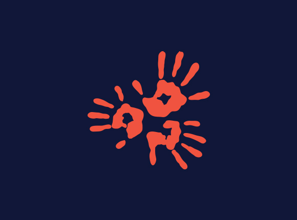
The impact of this logo extended far beyond its visual appeal, serving as a unifying symbol across a myriad of communication materials, including information flyers, annual reports, and digital campaigns. By seamlessly integrating the logo into these materials, the WHO leveraged its emotive power to foster greater awareness, empathy, and action surrounding cancer prevention and treatment. Ultimately, this project exemplifies the transformative potential of design to inspire, unite, and drive positive change on a global scale.