
Schein Design Lab
Schein Design Lab is at the forefront of creating exceptional user experience strategies for its clients. The task at hand was to craft a visual identity that mirrors their commitment to user-centric design while capturing their unique essence.

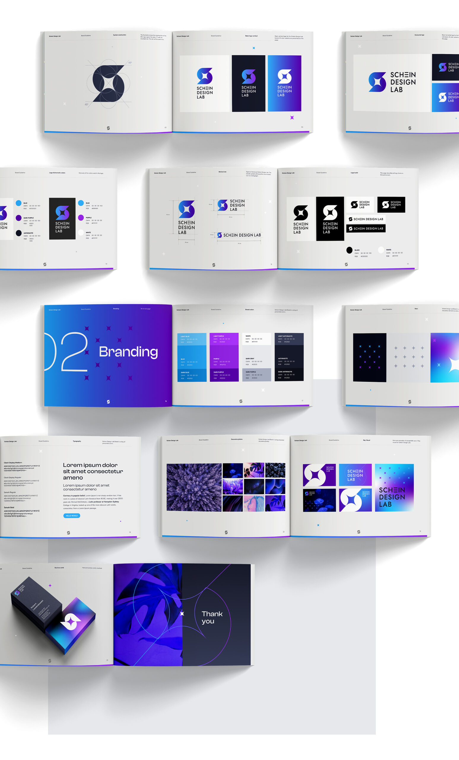
Logo Creation
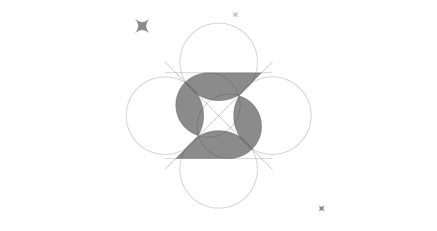
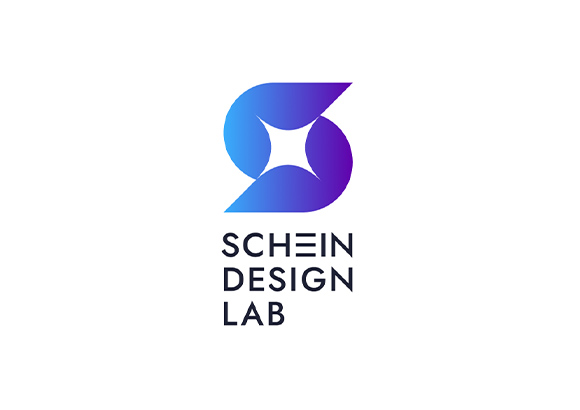
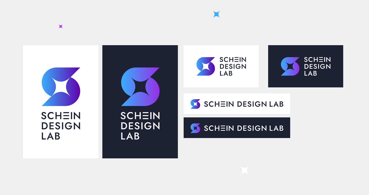
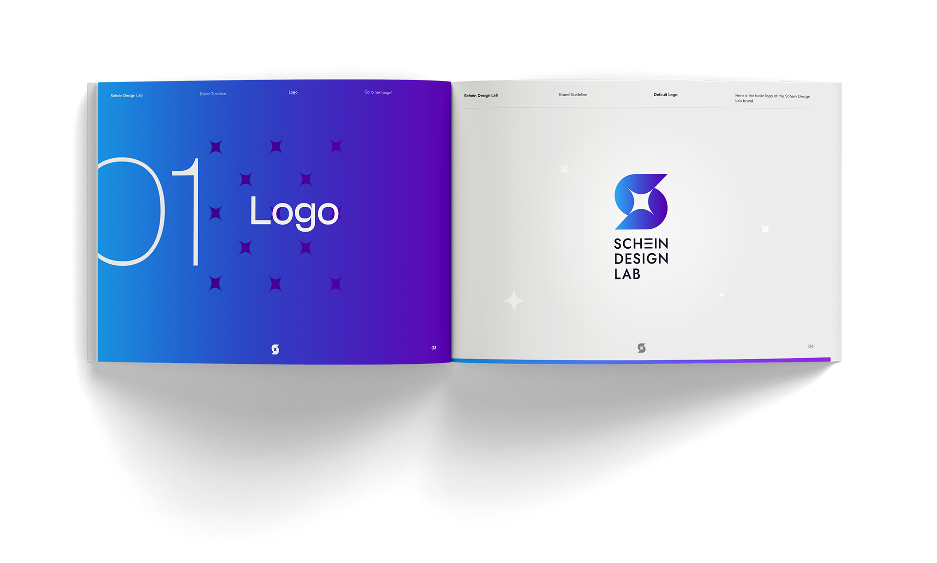
At the heart of Schein Design Lab is a distinctive logo that encapsulates the essence of innovation and creativity. The bold use of purples and blues adds a touch of elegance and modernity to the design.
Brand Consistency
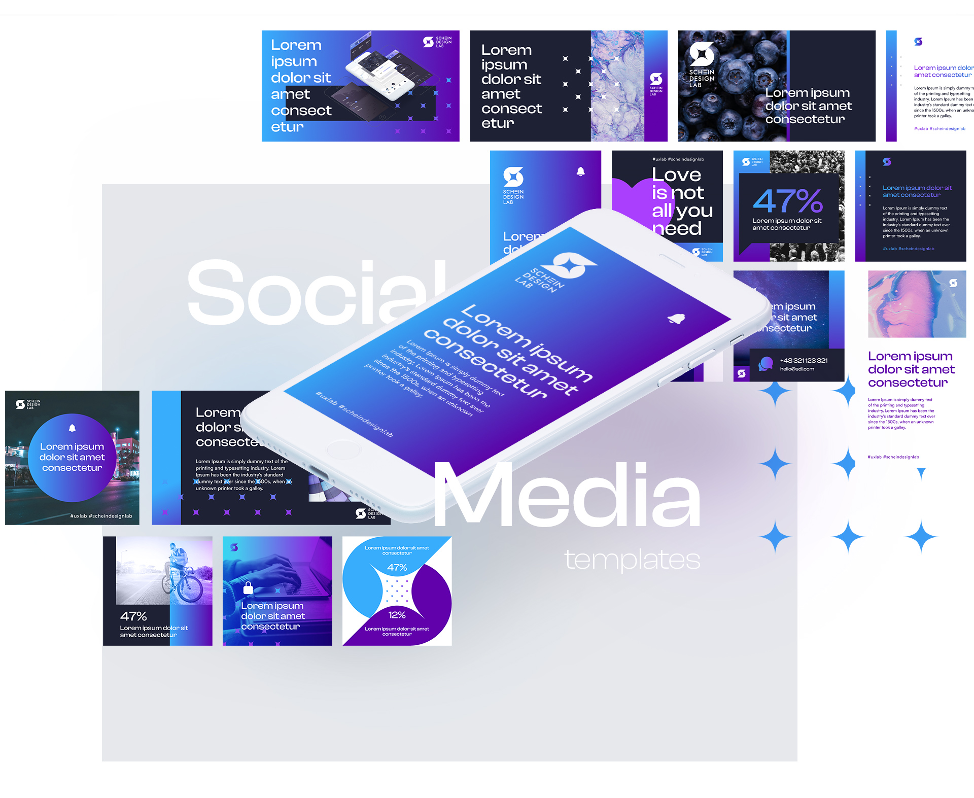
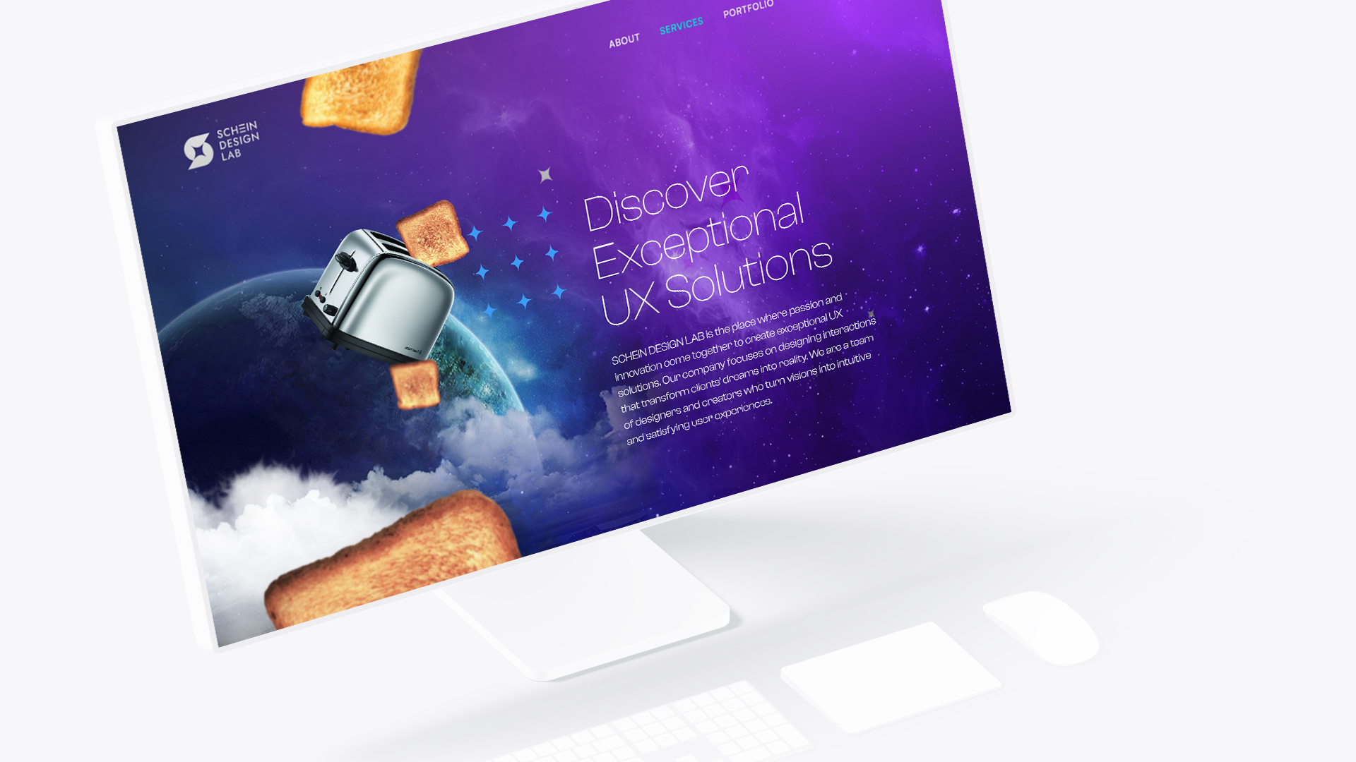
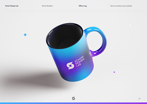
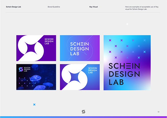
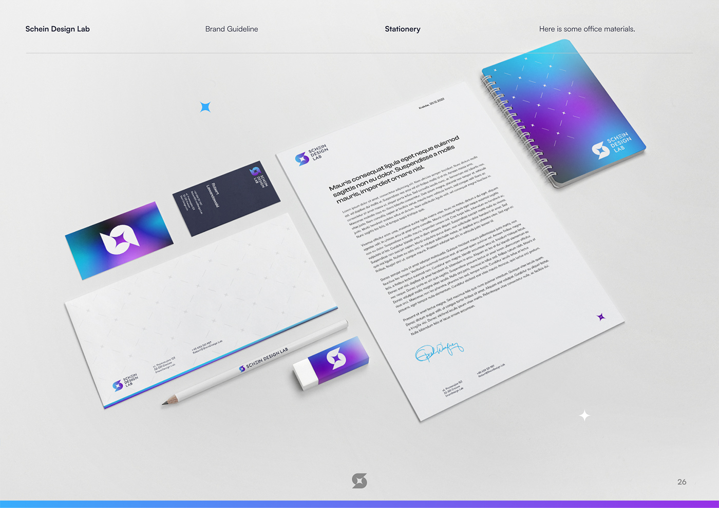
I extended the color scheme and design elements across Schein Design Lab’s entire brand ecosystem, including client’s website, presentation materials, and marketing collateral. This brand consistency reinforces their commitment to delivering consistent, user-centric solutions.
Visual Identity
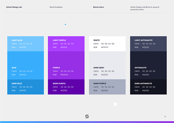
The foundation of Schein Design Lab’s visual identity is rooted in our strategic use of colors, particularly deep purples and calming blues. These colors were selected not just for their aesthetic appeal but for their ability to evoke a sense of trust, creativity, and reliability—essential qualities in the world of user experience design.
Target Audience
The visual identity aligns perfectly with Schein Design Lab’s primary audience – businesses and organizations seeking UX solutions that are both innovative and dependable. The color choices and design elements speak directly to the expectations and values of this clientele.
Personal Involvement
As the designer behind Schein Design Lab’s visual identity, I played a pivotal role in translating their core values and mission into a visually appealing brand image. Every element was meticulously designed to reflect their dedication to user-centric design.
Notable Achievements
Schein Design Lab’s new visual identity has received acclaim for its ability to convey a sense of trust, creativity, and innovation. This project stands as a testament to the power of visual branding in the world of user experience design.
schein = shine
Schein Design Lab’s visual identity project is a testament to my expertise in translating the essence of a company into a visual language that resonates with its audience. It showcases the power of the purple and blue color palette, turning it into a distinctive brand presence for a UX design company that understands the importance of user-centric design.