

Założenia
The project’s goal was to create a cohesive graphic system that reflects the company’s core values: responsibility, trust, and modernity. I wanted to move away from the heavy, warning aesthetic typical of the occupational health and safety industry—instead, I focused on purity of form, legibility, and calm confidence.
Proces
The project began with a competitive analysis and analysis of the visual language of the security industry.
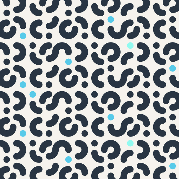
From this, a concept was developed based on simple, geometric forms and a subdued color palette—combining professional navy blue with accents of orange, symbolizing energy and protection.
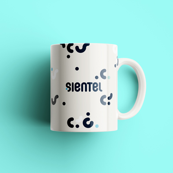
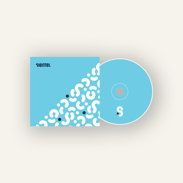
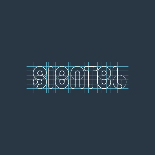
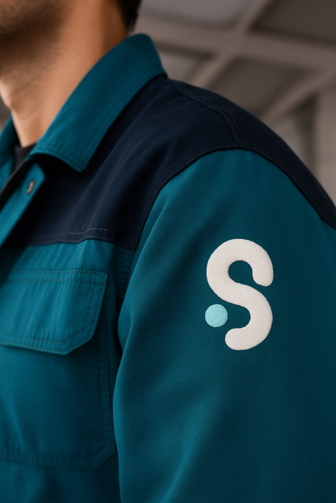
A new logo, icon system, color scheme, and typography were created, as well as corporate materials—from business cards and letterhead to website layout and training graphics.
Efekt
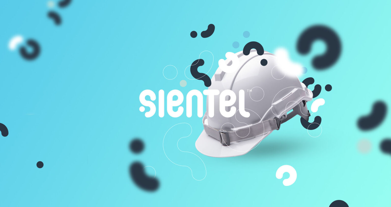
The result is a visual identity that communicates safety without overly dramatic elements.
Sientel has established itself as a modern partner in occupational health and safety—a brand that combines professionalism with a human touch and transparent communication.
Branding / Identyfikacja wizualna / BHP / Minimalizm / Nowoczesność / Zaufanie

zxcsdfs dfs dfs dfsd fds s