

Art Direction
Visual Identity
Key Visual
Campaign
Environmental
Event Materials
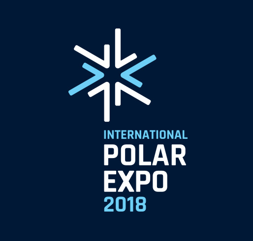
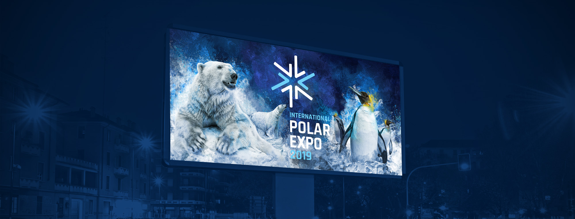
Polar Expo was a visual identity and communication project developed for a planned event in Katowice. The challenge was to create a strong central idea and turn it into a flexible visual system — one that could work across multiple formats while creating a distinctive world around the event. From the initial concept and logo to the key visual, campaign and environmental applications, this case study explores how the Polar Expo identity came together.
01
The Challenge
Polar Expo was conceived as an event planned for Katowice. The goal was to create a distinctive visual identity and communication system that could work consistently across multiple touchpoints — from digital communication and print to environmental graphics and event materials.
The challenge was not only to design a recognisable identity, but to create a visual world strong enough to carry the entire event experience.

02
The Idea
Two poles. Two ecosystems. One visual world.
The central idea behind the identity was to bring together two environments that exist at opposite ends of the planet.
The key visual combines a polar explorer with polar bears and penguins — species that would never naturally meet. By placing them in one shared environment, the contrast between the Arctic and Antarctica became the foundation of the event’s visual language.